It all starts with the colors of choice when it comes to branding and marketing. Colors can alter how people perceive and react to specific products and brands as a whole. Marketing experts can harness that emotional reaction to boost the success of their marketing and branding initiatives.
Knowing more about the psychology of color may help you create advertisements and logos using colors that help people recognize your company subconsciously, therefore, drawing them in.
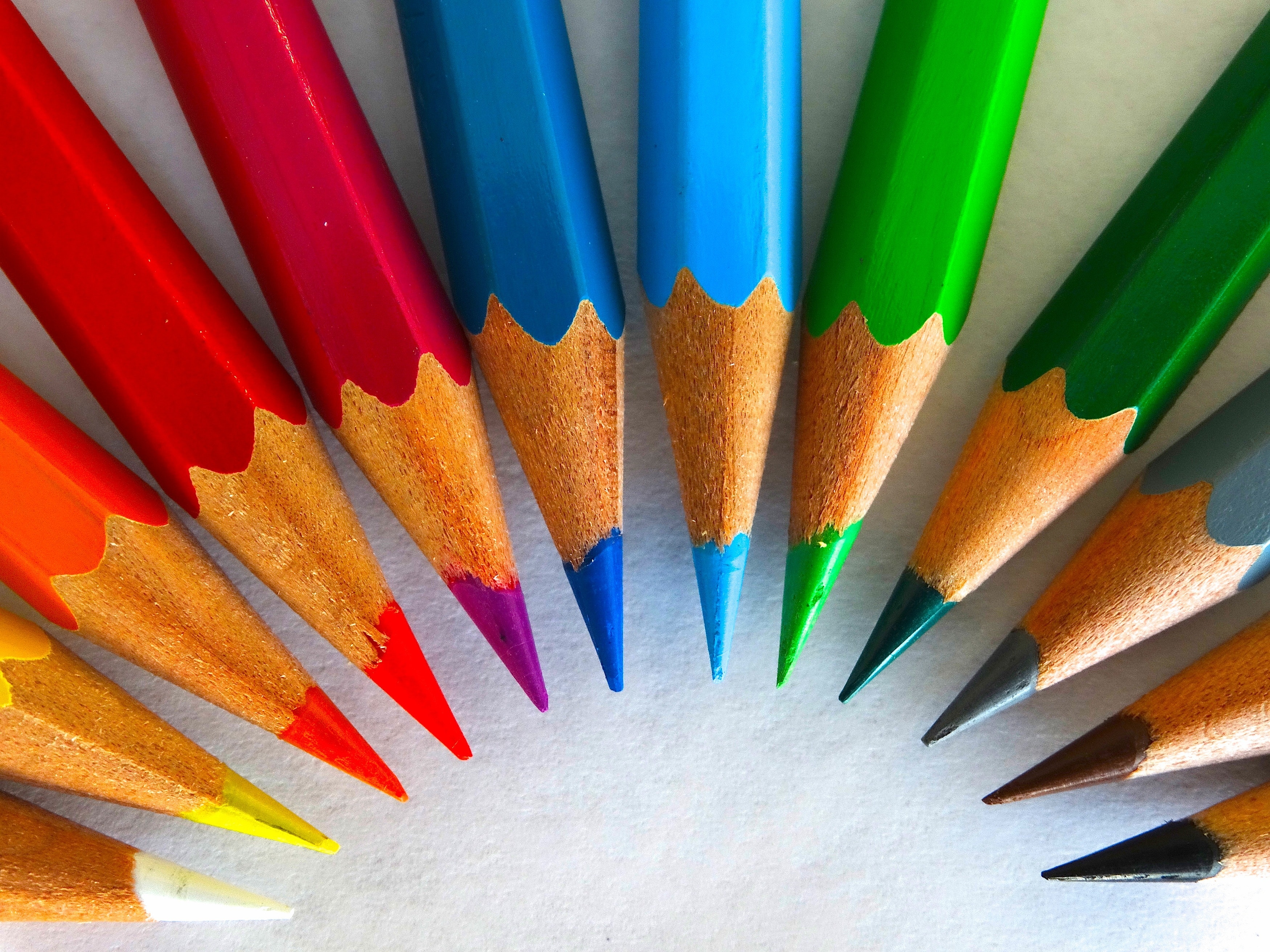
In this article, we shall further discuss the importance of colors and the top 8 colors commonly used in marketing.
What Is Color Psychology?
Color psychology is the research of how different colors influence people's perceptions and behavior. It’s critical to choose tones that correspond with your company's objectives and target demographic. Color psychology in marketing and branding is concerned with how colors influence customers' perceptions of a brand and whether or not they convince consumers to consider certain brands or purchase from them. It's a vital subject of study to think about when developing marketing strategies, starting a new firm, or rebranding an established one.
In fact, a study titled "Impact of Color on Marketing," discovered that colors alone can account for up to 90% of rapid assessments regarding products. Hence, why some people actually buy a product just because they love the color of the packaging used.
Why Is Color Important When It Comes To Marketing?
Color plays a big role in marketing because of the psychological impact that different colors may have on people. Upon seeing a color, they form subconscious opinions about their surroundings, people, and things. Warm colors, for example, are often associated with vitality, whereas cold colors are associated with tranquillity.
People may gain insight into what a brand stands for by the colors you use to market it. Color psychology may be applied to the design of advertisements, logos, and websites. Think about well-known brands, the colors you identify with them, and how your opinion of the brand may alter if the color of the logo changes.
When utilizing color in marketing, we strongly recommend keeping the following tips in mind :
Analogous: Analogous color schemes combine three neighboring colors to create a seamless connection between them.
Complementary: Complementary schemes use colors from opposing sides of the color wheel to create a striking contrast.
Monochromatic: Monochromatic schemes use three distinct shades of a single hue to create a subtle yet classy aesthetic.
Vibrancy: Vibrancy applies to the intensity of the colors you use. Brighter colors tend to feel more vibrant, but they should be used with caution because they can off quite overpowering to certain customers.
Amount: Different outcomes can be achieved depending on how much color is used in a design. Small amounts can be classy or uninteresting, while huge amounts can either be exhilarating or overpowering.
Now that we have covered the fundamentals of color psychology. Let’s take a look at the colors most often used by marketers :
Red
Red is a prominent marketing color because it is eye-catching and may elicit significant psychological responses. Red is the color of intensity, exhilaration, desire, and urgency. Fast food restaurants and clearance sales typically use red because it elicits an impulse to act quickly. Try using several shades of red in your advertisements to set them apart from those of other companies that utilize the color. Even the slightest bit of variation in saturation might lead buyers to connect your company with that distinctive shade of red.
Blue
Did you know that blue is the most favored color worldwide when it comes to marketing? It is often associated with calmness. Blue is a color that helps relax individuals by reminding them of reliance, trust, and security. Hence why this color is widely used by brands that want to develop a sense of trust with their clients, such as financial and healthcare firms. Many social media platforms utilize blue as well since it is associated with intellect and communication. Blue can also increase productivity and indirectly increase sales by relieving anxiety.
Pink
Pink is a vibrant, eye-catching color that invokes feelings of enthusiasm, optimism, passion, and inspiration. It can also make individuals think about their youth and fun, as well as dreams, fantasy, romance, and magic. Pink is a popular color for businesses that provide baby items, toys, beauty, or sweets. Pink has also lately been employed by brands to appeal to younger people, women in particular.
Green
Green may trigger sentiments of peace, healthiness, loyalty, and comfort, making individuals feel at ease and safe. Green is widely used in stores to make customers feel more calm, which might inspire them to make more definite decisions. It also conjures up images of nature, making it a favorite among eco-friendly firms. Some individuals also connect the color green with money, which may cause customers to connect a brand with affluence.
Black
The color black conveys feelings of dominance, force, stability, and strength. When used in excess, it may be an overwhelming color, but it can also represent richness, refinement, timelessness, and mysticism. Depending on its purpose, black may be both classic and modern, making it a very versatile color choice. When coupled with contrasting colors, black can appear extremely sophisticated.
White
White is a common color in sectors like health care and cleaning because it represents simplicity, cleanliness, and purity. It may also signify a blank canvas with limitless possibilities, which is ideal for a creative brand looking to inspire its consumers to create something different. The color white is also perfect for a brand that's minimalist and is not looking to overwhelm consumers with an array of colors.
Purple
Purple is a regal color, representing elegance, grandeur, refinement, and respect. It is a common color for high-end items that wish to exude a sense of luxury. Many cosmetic and anti-aging products have purple in their packaging and advertising. Purple may also be a mysterious color that works well for artistic or eccentric companies.
Orange
Orange is a color that is a mix of yellow's cheerfulness and red's vitality, resulting in a color that inspires individuals to feel cheery, energetic, and outgoing. Orange is a great hue for a business that wants to seem hip, imaginative, and entertaining, or for a brand that wants to be associated with adventure.
Make Color Psychology Work For You
To summarize, it is critical to note that color psychology will have an impact on your marketing. Your target audience will form opinions about how well your branding colors complement your company. Feel free to use the information we’ve provided you in this article when you’re coming up with your brand aesthetics. Happy designing!
SO, WHERE DO YOU FIND THIS PARTNER?
Well, aren’t we glad you asked! We at DigiCom are obsessive data-driven marketers pulling from multi-disciplinary strategies to unlock scale. We buy media across all platforms and placements and provide creative solutions alongside content creation, and conversion rate optimizations. We pride ourselves on your successes and will stop at nothing to help you grow.


